The overall impact of evolving output media on the design and creation of graphic images can only be a good thing. The new technologies involved in creating and viewing graphic images mean that images today are much more clear and life-like. The introduction of "next-gen" gaming meant output media needed to stay one step ahead, monitors have always had the capabilities to play whatever you can throw at them, but the last few generations of monitor have concentrated on size and price, meaning the next-gen gamers werent getting the quality of images console gamers got on TVs. In the last few years however, monitors have been made with picture quality first, this has kept them one step ahead of TVs, not just in price, but quality.
Printers have always been expensive if you wanted to get the kind of picture your happy with. The prices would jump massivly for a short increase in quality, so if people wanted real quality the only option was to get them printed elsewhere, usually their local library. Printer quality has always been there, but the last generation has seen printers evolve into a scanner, colour copier and a fax machine all in one. This is great if you happen to need all of those features, if not then you will find yourself paying the same amount for just the printer of the same quality. With all these new features comes a new, much more advanced way of using it. The options to you are endless, but only if you can get it working atall. All this means The design and creation of graphic images is left to the side, and it seems the only issue is price.
Monday 3 November 2008
File size and image quality changes
Vector Images (.DXF) are made using mathematics, angles, percentages etc. instead of pixels. This means the file size of a vector image is much less than the file size of a jpeg image. This also means because the mathematics dont change with larger images the image keeps its quality when resized.


 As you can see when left at the correct size Jpeg images are much more detailed than vector images, but when resized most of the quality is lost.
Compression techniques such as WinZip will compress the file to make it as small as possible. When unzipped the image will be the same file size as it was originally and still have its original charactoristics.
Image resolution is the overall detail level in the image, because .DXF is a vector image the overall image detail is not as high as it would be if it was a jpeg. The colour depth of an image is the bits per pixel, the more bits in a pixel the more colours are available to make the image more lefe-like. Vector images dont use pixels so this doesnt come into effect untill the image is pinted, and then its down to the printer defaults.
Vector Image:

Although this image is saved a a Gif you can still see how mathematics are used to create the image, meaning it can be resized without the loss of quality.
Jpeg images:


Compression techniques such as WinZip will compress the file to make it as small as possible. When unzipped the image will be the same file size as it was originally and still have its original charactoristics.
Image resolution is the overall detail level in the image, because .DXF is a vector image the overall image detail is not as high as it would be if it was a jpeg. The colour depth of an image is the bits per pixel, the more bits in a pixel the more colours are available to make the image more lefe-like. Vector images dont use pixels so this doesnt come into effect untill the image is pinted, and then its down to the printer defaults.
Thursday 12 June 2008
Define and document a client and user need for three related graphic images
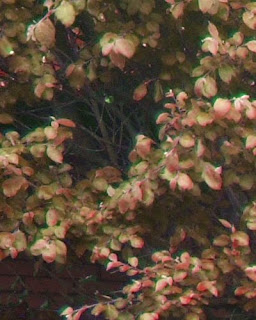
The last images i have been asked to make is 2 different images of a bush using the same template picture but make them both look different, one is a summer picture, the second one is an autumn picture, these are the results i got:
Image in summer:
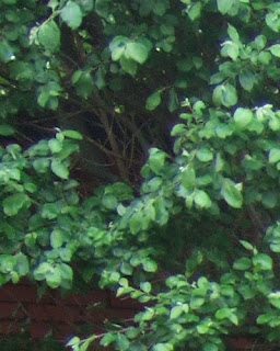
Image in autumn:
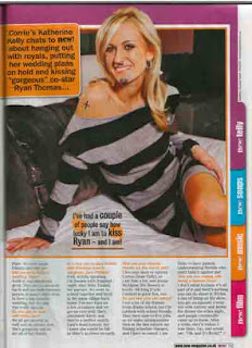
The last image i was asked to edit was a peice from a magazine that was graffitied, i was asked to put the things that were wrong correct again, only the face and arm were graffitied so editing it didnt take too long.
Before editing:
After editing:

Image in summer:

Image in autumn:

The last image i was asked to edit was a peice from a magazine that was graffitied, i was asked to put the things that were wrong correct again, only the face and arm were graffitied so editing it didnt take too long.
Before editing:

After editing:

Friday 6 June 2008
Potential legal implications
Copyright
Pretty much the only legal implication when using/editing graphic images is copyright, which generally means "the right to copy". Alot of images are either copied from someone elses design or directly copied then edited, this is not neccessary against any copyright laws because the image is not the same as the original. Although aslong as the credit is given to the original creator it is possible to actually copy and use the image. In order to actually copy and resuse someone elses images you need to ask the permission of the owner.
Identifying ownership
If the image has a logo or stamp on or near the image it signals the ownership of the image and who has the rights to that image, if a logo isn't on or near the image then the rights of the image might be owned by the owner of th website, so to use the image in anyway contacting the website owner may be the best option.
Copyright Free
Any image that is copyright free can freely be used, edit and distributed to anyone you desire, these images are usually images that are free with graphic packages or websites that clearly identifies their images as copyright free.
Thursday 22 May 2008
Define and document the client and user needs
Firstly my ncompany will need a new banner to advertise our new game, it will need to be a standard A3 sized poster with as little actual information as possible because it is only going to be used as a teaser poster, it will only need an image of one of the game characters, with the game creators, age certificate(18) and the games title: "Death By Turtle".
I will also need a game case front page to go with the poster, again it must have the games name on it and the quote "How will you survive?". It must also have an image of the main character on itas the focal point, it must also be a a variation of both dark and bright colours, to emphisise both aspects of the game, turtles and death.
The final thing i will need is a new small poster to be passed put by hand, a4 sized. The images again must also be very secretive and cannot give too much away, the iamges required for the poster will be included so you know what you can use. The colour scheme must also be very dark but with highlights of colour.
Two advanced techniques


The image on top is the original image, on below is my edited version of the image. I have made it slighty brighter to lighten the overall effect and make it a much nicer image to look at, to do this i created a few new layers, blured them and changed the blending optins untill i was satisfied with the result. I then added the sun in the distance to give the image a more holiday-like look. To create the sun i made a new layer then added a filter: lens flare, then i went through the blending options untill i found the option to best suit the image.


The top image is the original image and the bottom image is the one i have edited. There are multiple layers making up the look of the image, firstly i copied the layer and put the filter accented edges on to get a white outline around the main features of the image, i then made several new layers to create the colour inside the white lines, different filters and effects are being used on each layer, some layers have gaussion blur, some have filters with different blending options, such as; color dodge, soft light and hue as well as a few others.
Wednesday 7 May 2008
Vizual impact report
Image One EnCert

Techniques used

Techniques used
Firstly i got the background image from an old vista background and positioned it in an appropriate place for what i will do next, which was the text, to create the text i firstly made various text effects to create a chrome effect on the text, i then went through the selection of PhotoShop standard fonts to find the one that i believed best fit the image. i then made the windows logo a chrome-like design; to do this i took the original windows logs and blured it so it would look asif the new logo i created would have a glow of the original windows logo colours.
Evaluation

Techniques used
EnCert is a new company who have asked for a logo to be designed for their website.They provide certificates to home buyers to show how 'green' the house is. This is legal requirement for homes sold in the UK with 4 or more bedrooms.
My rough design:

Techniques used
To create the image i firstly used a simple font to create the "En" and then made a new text layer and typed "Cert". I then cut and added new peices to get the effect of the writing touching eachother, for the windmill effect at the side of the logo i added an image of a windmill from google and colourized the windmill to match the colour of the writing.
Evaluation
The images modern look is done by the use of current graphic design/logos because it is a simplistic yet effective design.
The whole graphic is green to represent the "green" nature of the company. The windmill on the image is also a "green" statement because of the "green-ness" of windmills.
The images modern look is done by the use of current graphic design/logos because it is a simplistic yet effective design.
The whole graphic is green to represent the "green" nature of the company. The windmill on the image is also a "green" statement because of the "green-ness" of windmills.
Justification
This image was designed and created using Adobe Photoshop. This software is the industry standard for creating images of this type, however for logos a vector image may be more appropriate but as i decided to go for quality above anything else i decided to use Adobe Photoshop, this is also due to the vast amonut of tools available to make the image perfect. The file formats used for this image are .PSD and .jpg. The reason for saving the image as a PSD file type is so that in the future i can easily edit the image in Photoshop as it saves all the layers, effects etc i used when creating the image. The reson behind using jpeg was because it is a standar file extention that keeps file size down but keeps image quality high.
This image was designed and created using Adobe Photoshop. This software is the industry standard for creating images of this type, however for logos a vector image may be more appropriate but as i decided to go for quality above anything else i decided to use Adobe Photoshop, this is also due to the vast amonut of tools available to make the image perfect. The file formats used for this image are .PSD and .jpg. The reason for saving the image as a PSD file type is so that in the future i can easily edit the image in Photoshop as it saves all the layers, effects etc i used when creating the image. The reson behind using jpeg was because it is a standar file extention that keeps file size down but keeps image quality high.
Image Two is the Microsoft poster
Microsoft has approached me to produce some displays for its stand at a show to be held in the Birmingham NEC publicising its newest operating system. They require a graphic that could be printed onto a large piece of card to be used on the Microsoft stand.
Microsoft has approached me to produce some displays for its stand at a show to be held in the Birmingham NEC publicising its newest operating system. They require a graphic that could be printed onto a large piece of card to be used on the Microsoft stand.

Techniques used
Firstly i got the background image from an old vista background and positioned it in an appropriate place for what i will do next, which was the text, to create the text i firstly made various text effects to create a chrome effect on the text, i then went through the selection of PhotoShop standard fonts to find the one that i believed best fit the image. i then made the windows logo a chrome-like design; to do this i took the original windows logs and blured it so it would look asif the new logo i created would have a glow of the original windows logo colours.
Evaluation
The image shows exactly what is needed and nothing more, as its a poster its only designed to be looked at and not read, making alot of text unnessesary. The colour scheme matches the chrome theme of the new OS which is an important feature from a design point of view. the text isn't as clear as it could be but the vizual effect of the image more than makes up for this.
Justification
This image, aswell as the EnCert Logo was designed and created using Adobe Photoshop. This software is the industry standard for creating images of this type, this is due to the vast amonut of tools available to make the image perfect, these tools can help when changing the resolution and colour depth. The colour depth in Photoshop is 72 bit the same as most pinters standard, so no editing is neccessary when printing.. The file formats used for this image are .PSD and .jpg. The reason for saving the image as a PSD file type is so that in the future i can easily edit the image in Photoshop as it saves all the layers, effects etc i used when creating the image. The reson behind using jpeg was because it is a standar file extention that keeps file size down but keeps image quality high.
Image Three is the organic foods mobile fast-food service roadside sign.
An organics foods mobile fast-food service has requested a roadside sign. It will be used on a stand so when its van is parked in a lay-by offering quality burgers and all-day breakfasts, passing motoists will notice it. This sign is to be in full colour and must be eye-catching

Techniques used
Firstly i got the image of an organic burger and added the relevent text, as its a roadside sign not alot needs to be on it as you'll be driving past and wont have time to read alot of writing or look at fancy images. It's because of this i chose to only put what was neccessary on the sign.
Evaluation
The image only has exactly what is needed as stated above, this is because it will only be read when going along the road at speed and having lots of writing on is just as waste of time as they wont have time to read it, fancy images are also a waste of time which is why i chose i simple but perfect image, an organic burger.
The image only has exactly what is needed as stated above, this is because it will only be read when going along the road at speed and having lots of writing on is just as waste of time as they wont have time to read it, fancy images are also a waste of time which is why i chose i simple but perfect image, an organic burger.
Justification
This image was designed and created using Adobe Photoshop. This software is the industry standard for creating images of this type, however for this type of simple yet effective roadside sign any graphics programme is useable with a goo outcome, but as i decided to go for quality and useability above anything else i decided to use Adobe Photoshop, this is due to the vast amonut of tools available to make the printing proccess very simple, as Photoshop colour depth is 72 bit as standard, the same as most printers. The file formats used for this image are .PSD and .jpg. The reason for saving the image as a PSD file type is so that in the future i can easily edit the image in Photoshop as it saves all the layers, effects etc i used when creating the image. The reson behind using jpeg was because it is a standar file extention that keeps file size down but keeps image quality high.
Subscribe to:
Posts (Atom)